Monday, 18 February 2013
Franz Kafka's Metamorphosis book cover design...
Well here is why I needed to sketch upside down Volkswagen Beetle cars in my last but one post. The notion for this cover is a little bit tongue in cheek (for those who haven't read the short story it's about a chap who wakes up transformed into a giant beetle) but something about the idea appealed to me. Perhaps it's the mix of the iconic story and the iconic car... maybe the surreal nature of the plot is amped up that little bit more by seeing a car in bed...? Whatever it is there was also the challenge to show the cover without resorting to the usual design treatment showing images of an actual insect. All the cover and spine text is hand cut from card or paper for that more disjointed, slightly insectish feel. I hadn't planned on the 'headlamp' O's for the title or the tyre tread pattern for the book's spine but they were spur of the moment choices that just seemed like the right thing to do to help with legibility of the title, tie the front and back covers together and also lay on the VW beetle theme a little bit thicker.
Tuesday, 12 February 2013
Ceci n'est pas un pope
On hearing the news that the pope was off this idea floated into my head and I had to do it... (apologies to Magritte... and any french speakers). Incidentally, with those red shoes, it seems to me that the Pope would make a cracking alternative to Dorothy in the Wizard Of Oz.... following the yellow brick road to the Emerald Vatican City... clicking his heels together saying "there's no place like Rome"... That's me dammed for eternity now I suppose...
Monday, 11 February 2013
upside down VW beetles...
I needed to sketch a VW beetle but it has to be upside down for the illustration I have in mind. Rather than draw the car the right way up then invert it I thought, why not draw the thing upside down to begin with (rotating and flipping the reference in photoshop) and see what happens...? I found it a very useful exercise in quick observational drawing. Very much looking at something familiar in a fresh new way. I also like the slightly disjointed feel it gives to the car (stand on your head to see what I mean)... as luck would have it that should fit in nicely with what I have planned for the bug... ...
Now what else can I draw upside down...
Now what else can I draw upside down...
Wednesday, 6 February 2013
Tuesday, 5 February 2013
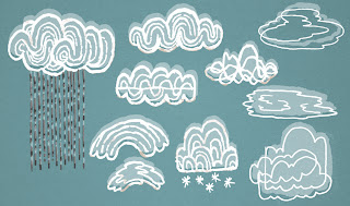
fire and clouds... and back beside the seaside...
I've a big stack of low grade cardboard by my desk that just seems to love thick nib sharpie marker pen. For whatever reason my mind turned to cloud doodles today then, perhaps by way of elemental balance some flames also flared up. A quick bit of photoshop and nothing goes to waste on this blog. Next time I need to fill a sky or set something alight (in an illustration that is) I've some designs to choose from.
In fact I might well make use of my clouds sooner rather than later as I've started to tackle the seaside screen print scene I put to one side before christmas. I'm sure it was limiting myself to just a single colour print that caused me problems before. The design just wasn't feeling right. I've decided to whack a couple of colours in there, loosen up and see what happens. Here's a very rough in progress post for the present. Still planning the colour and composition. I don't know how obsessive I'm going to go with line and detail but I must admit that I'm quite liking the rough energy that this has so far. Don't over work things...!
Sunday, 3 February 2013
a tiger for self promotion...
By way of a little self promotion I illustrated this banner design recently for a UK deign company called Tigerprint. They sent out a shout for creatively minded folks to design a website banner using their company name as the initial hook... I already had a tiger design which I was sure would fit the bill... long story short, hello tiger! It was a nice opportunity to work upon the foundations I'd layed with the first screen print design, rejig some design decisions I'd made, play with appropriate hand lettering and push the character's personality that bit further (I think I just about got away with slightly unhinged expression verses lazy eyed...!? ;-).
Subscribe to:
Comments (Atom)


