Anyone who knows me will tell you how much of a fan I am of the TV comedy Black Books written by the comedy genius that is Dylan Moran. I've illustrated my take on the fictional, sinister beverage "Life Cry" that appeared in the show but another subject I wanted to tackle was the dilapidated shop front that appeared in the show's titles.
A few weeks back I had some time to kill in London so I thought I'd go on a comedy pilgrimage of sorts and check out the exterior shooting location they actually used for the show (a real bookshop in Bloomsbury called Collinge & Clark). It's an odd experience, kind of like stepping into the TV itself, to find yourself standing in front of a fictional location you're very familiar with. Once I'd stood in front of Bernard's shop I wanted to draw it even more.
For a while now I've been reading up on the work of the British painter & illustrator Eric Ravilious. One of his sets of prints form the illustrations for a book called High Street, and one print I'm particularly fond of is the quirky and beautiful submarine engineers. Now I'm wholly not sure why but I thought that this high street shop seemed a good match for the Black Books bookshop and I wanted to approach my illustration with a nod to how Ravilious had treated his submarine engineers. As it would turn out I couldn't help but stray farther and farther from his style as I went on but it was good to have Ravilious and his colour separations in mind as I went along.
I hadn't intended too but I also incorporated several hand lettered lines of dialogue from the show (all text is copyright the estimable Dylan Moran) that referenced the shop itself. It seemed appropriate.
Long story (and too many links) short here's what I ended up with. Now go watch Black Books!
Showing posts with label digital. Show all posts
Sunday, 1 May 2016
Monday, 11 January 2016
and I think my spaceship knows which way to go...
Sunday, 30 November 2014
a somewhat spotty triceratops...
Here's my (last minute) creature for this months a little bit bunny. Triceratops was always my favourite dinosaur as a kid (so many pointy bits, though not as many spots as mine now has)... but, for a wee while, there was some proper noun panic over whether it really existed...
Monday, 10 November 2014
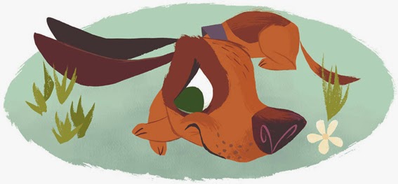
Aesops fable of "The dog and his bone" for Storytime magazine...
In some small defence of my slipshod blogging of late I've had one or two illustration jobs that I had to keep under wraps until they saw print. One such commission was for the grand folks at Storytime magazine who kindly asked me to provide illustrations for the Aesops fable of the dog and his bone (a.k.a the dog and his reflection) for their November issue. Y'know the story; dog finds bone, dog happy with bone, dog sees his reflection with said bone in the river and thinks it's another dog with a better bone, so dog goes to bark at this 'new' bone owner and nab the better bone... What do you know, dog loses his bone in the river... The moral of this fable, avoid rivers!
I pitched three different dog characters (named Sniffer, Banger and Spot... for ease of distinguishing them apart) for Storytime to choose between. Most gratifyingly, after the story was illustrated, they asked for a further group illustration of all three dogs (plus heads and a bone icon) to use for a game page to accompany the original story. All in all a very rewarding brief to work on.
I must say it's great to see the modus operandi Storytime have adopted for themselves, commissioning a variety of distinctly different illustrators to accompany a stimulating mix of story content in a well designed and produced quality magazine for children. Long may it continue.
I pitched three different dog characters (named Sniffer, Banger and Spot... for ease of distinguishing them apart) for Storytime to choose between. Most gratifyingly, after the story was illustrated, they asked for a further group illustration of all three dogs (plus heads and a bone icon) to use for a game page to accompany the original story. All in all a very rewarding brief to work on.
I must say it's great to see the modus operandi Storytime have adopted for themselves, commissioning a variety of distinctly different illustrators to accompany a stimulating mix of story content in a well designed and produced quality magazine for children. Long may it continue.
Sunday, 19 October 2014
an orangutan on a penny farthing...
Well then, what better way to break a prolonged dry spell on the old blog but an orangutan on a penny farthing... (incidentally I don't think there is an answer to that...). I recall many conversations with friends about the ergonomic considerations for vehicles, furniture and the like, should apes have culturally and technologically evolved a pace like we hairless chimps did. Just think of it... Certainly there would be buttons and switches on car floors. Chair seats would be lower down while arm rests would be longer (the budget 'cattle class' airlines wouldn't be economically viable in an ape world), and the handle bars of bicycles would be higher up!
As usual with my illustrations for a little bit bunny blog I'll post sketches plus a sneak peek of the final pic here, pop on over to A.L.B.B blog for the full thing. TTFN.
Saturday, 21 June 2014
don't believe those crocodile tears...
It's been far too long dear blog. Please excuse the lack of posts but I've creative projects ongoing that I couldn't post about, at least not yet. Thankfully good old a little bit bunny blog is always there, as it's supposed to do, to encourage me to blow the cobwebs off and post something. Well this months ALBB creature is the crocodile and I had great fun getting inky and tearful! Here, as always, is some of the sketch work plus a detail of the final illustration.... pop on over to a little bit bunny blog if you'd like to see all of the emotional croc.
Okey dokey, I've a book cover to design, but first I have to read the book... TTFN
Tuesday, 25 February 2014
tardigrades... and an interview...
Time to break the dry spell on the blog, and as is my wont I'll do it with this months ALBB creature which is the tardigrade. Truly fascinating little fellows these. Tough as old boots too. Burn 'em, freeze 'em, dry 'em almost to dust... high pressure, the vacuum of space, massive doses of radiation... all that and these little tardigrades (aka moss piglets or water bears... ahhh) keep on keeping on. Hard as nails and yet still thought by many to be the cutest of microscopic critters. Well worth a read all about them. I've opted for a variety of colourful mossy piglets for the illustration and just had fun with different characters. As always, here is a sneak peek and some sketches (and collage elements) while the final illustration is over on a little bit bunny if you would like a look down the microscope!
While I'm blogging I need to also send belated yet sincere thanks to Craig over on Fishink blog for his asking for an interview and including me on his truly excellent blog of all things illustration, photography and textiles. Much as I hate talking about myself it's hard to shut me up once I get waffling about illustration as a topic! I cannot recommend Fishink blog highly enough. Just looking back through his posts it's spooky how similar a lot of our visual tastes are and he's also posted a wealth of words and pictures on many glorious illustrators I'd certainly never come across before. Bookmark fishink and I guarantee it will give you all the illustration eye candy you could wish for! Cheers again Craig.
Saturday, 21 December 2013
yule frog eats mince flies holiday pun shocker...
Nothing says festive celebration more than weak word play for comic effect ;-) Well that and poor handwriting on a card (it's been years since I wrote this much in longhand). Pull a christmas "croaker" just hopped to mind too (lucky I didn't use that then). Puns and poor penmanship aside, "Hoppy holidays to all and to all a cracking new year!" See you in 2014 folks.
Saturday, 14 December 2013
Napoleon in America book cover and frontispiece artwork
Well it's been a while in gestation (and I've hinted at it in an earlier sketch) but I'm very pleased to be able to finally post the work for a commission I got recently to provide both the cover illustration and design for author Shannon Selin's epic historical novel "Napoleon in America".
Now I will admit that I didn't know a whole heap about Napoleon save for the odd factoids regarding hands in waistcoats, distinctive headwear, "not tonight..." comments and death by wall paper (look this last up, very intriguing). That being the case it's been an interesting journey reading Shannon's fascinating book and researching a little myself into the short guy (not at all the case... look up British propaganda and Cruikshank's cartoons...) with an abundance of character. I also learnt a fair amount on nautical accoutrement (ratlines, belay pins, bulwarks and such...) along the way.
Shannon and the folks at Dry Wall Publishing left the cover brief wide open, but gave some very handy pointers on geography and the world of 1820's America for me to get a hook on things. From there I pitched in with several possible approaches and, pleasantly they all liked a runner up cover concept enough to use it as a black and white frontispiece image alongside Napoleon surveying his new dominions atop a texas cliff on the cover.
There was even to some 'frankenstein forgery' to be done on Napoleon's signature for the title treatment. For this I created a cut and paste of the great man's (it has to be said, untidy) signature from several of his actual chicken scrawls. I then used this as my reference to rewrite it in ink for the cover. Ah, if only I could find Napoleon's cheque book.... he must have been good for a franc or two ;-)
Thanks to Shannon and Dry Wall for the inspiring brief and being a delight to work with. All I can say is if you already know something of Napoleon and would like to add to this with the alternative history of his exploits beyond St Helena (and all this based on an actual escape plan that was never set in motion... look that up too) or, you know little about him but love a good historical yarn (and you might just learn stuff along the way as I did...) look out for Napoleon in America, available in hardback, paperback and ebook early in 2014. Shannon has a pdf extract of the book on her own website if you would like your appetite whetted.
Incidentally I typed all this with one hand tucked in my coat ;-) The stereotypes still persist.
Now I will admit that I didn't know a whole heap about Napoleon save for the odd factoids regarding hands in waistcoats, distinctive headwear, "not tonight..." comments and death by wall paper (look this last up, very intriguing). That being the case it's been an interesting journey reading Shannon's fascinating book and researching a little myself into the short guy (not at all the case... look up British propaganda and Cruikshank's cartoons...) with an abundance of character. I also learnt a fair amount on nautical accoutrement (ratlines, belay pins, bulwarks and such...) along the way.
Shannon and the folks at Dry Wall Publishing left the cover brief wide open, but gave some very handy pointers on geography and the world of 1820's America for me to get a hook on things. From there I pitched in with several possible approaches and, pleasantly they all liked a runner up cover concept enough to use it as a black and white frontispiece image alongside Napoleon surveying his new dominions atop a texas cliff on the cover.
There was even to some 'frankenstein forgery' to be done on Napoleon's signature for the title treatment. For this I created a cut and paste of the great man's (it has to be said, untidy) signature from several of his actual chicken scrawls. I then used this as my reference to rewrite it in ink for the cover. Ah, if only I could find Napoleon's cheque book.... he must have been good for a franc or two ;-)
Thanks to Shannon and Dry Wall for the inspiring brief and being a delight to work with. All I can say is if you already know something of Napoleon and would like to add to this with the alternative history of his exploits beyond St Helena (and all this based on an actual escape plan that was never set in motion... look that up too) or, you know little about him but love a good historical yarn (and you might just learn stuff along the way as I did...) look out for Napoleon in America, available in hardback, paperback and ebook early in 2014. Shannon has a pdf extract of the book on her own website if you would like your appetite whetted.
Incidentally I typed all this with one hand tucked in my coat ;-) The stereotypes still persist.
chupacabra ... "the goat sucker"
December's creature for a little bit bunny blog is the chupacabra, and I wanted to get my submission in asap before the silly season blows up proper. To be honest this weird, fantastical cryptid creature didn't really inspire me (interestingly, it seems to have now been identified as being coyotes with mange... not a ideal illustration subject though) but, in translation of it's Spanish name into "goat sucker", a scenario did come to mind. As a happy accident I was able to continue a theme started with last december's ALBB creature goat and a follow on post from that with Joseph and his technicolour milk float! OK, so I'm a little off model in my new goat but it's nice to continue the story. Incidentally I still have a third Joseph illustration I want to tackle... it's only been a year since I thought of it!
I hope you all have a merry multicoloured slurrrrrp or two this christmas folks :-) Cheers!
As usual, just sketches and a cropped detail of the illustration here. Pop onto ALBB for the full image.
Sunday, 8 December 2013
Alice consults the (Cheshire) cat nav on which way she should go...
"Silly me", thought Matthew to himself. "I completely forgot to blog (part of) my picture of the Cheshire cat and tell the 'curiouser and curiouser' people to look for the rest on a little bit bunny blog. Honestly dear blog, the more time I spend illustrating the stranger it all gets. And now, I wonder, if a raven is like a writing desk what manner of creature is like a drawing board...? Perhaps a beaver... and sometimes a sloth?
Sunday, 18 August 2013
a 'medicinal accordion' for my grandad...
My Grandad is feeling a little out of sorts and short on breath once again so I did a little card to raise his spirits. He plays the accordion, in case I didn't mention that... Get well pronto Grandad.
I've also included my initial 'warm up' sketch for this. Now he doesn't look quite like this chap so, credit where it is due, to the grand reference photo I used as a starting point... google image search is a marvellous thing to be sure!
I'm working on a few things I cannot show straight away but I hope to have some Napoleon illustrations to post in the not to distant future... "not tonight", but when things progress and I've pulled my hand out of it's waistcoat so to speak :-)
On an unrelated note (though colour is always related)... I always doubt my colour instincts when I illustrate (and especially when I paint) and I'd love to hone my understanding that bit more. To that end (and to sit next to my colour wheel and swatch books...) I've just bought the full version of "Interaction of Color" (spelt incorrectly, can I get a discount ?) app for the iPad. I only dipped my toe into the coloUred waters but, from what I've seen so far, it looks great! Check out the features if apps are your thing.

I've also included my initial 'warm up' sketch for this. Now he doesn't look quite like this chap so, credit where it is due, to the grand reference photo I used as a starting point... google image search is a marvellous thing to be sure!
I'm working on a few things I cannot show straight away but I hope to have some Napoleon illustrations to post in the not to distant future... "not tonight", but when things progress and I've pulled my hand out of it's waistcoat so to speak :-)
On an unrelated note (though colour is always related)... I always doubt my colour instincts when I illustrate (and especially when I paint) and I'd love to hone my understanding that bit more. To that end (and to sit next to my colour wheel and swatch books...) I've just bought the full version of "Interaction of Color" (spelt incorrectly, can I get a discount ?) app for the iPad. I only dipped my toe into the coloUred waters but, from what I've seen so far, it looks great! Check out the features if apps are your thing.

Tuesday, 30 July 2013
a curious concoction... the Fiji Mermaid (Feejee Mer 'made')...
This months a little bit bunny creature was already pretty mixed up to begin with. The Fiji Mermaid... also spelt in the more salty sea dog vernacular "Feejee Mermaid" was a curious concocted creature to be sure. I won't go into the whole fascinating history of the beast, save to say, as far back as the early to mid nineteenth century sailors (possibly the best makers were Japanese fishermen, recreating the Nigyo of Japanese myth... very interesting deviation from the traditional western image of the mermaid by the way...) crafted these so called mermaids from bits of monkeys and fish joined together with liberal amounts of paper mache thread, wire, wood and, seemingly, anything else that was to hand. One such example (the first to bear the name Feegee Mermaid) was exhibited to great effect by the famous US showman P.T.Barnum along with a fabricated scientific provenance. Since then no self respecting sideshow has been complete without a gen-u-ine Feegee Mur-maid!
For my humble effort I tried at first to compare the western and eastern takes on the mermaid topic or, at least, to compare the fact and fancy of the whole thing. Beauty and the beast. I think, for me however, it's the back story of the side show flim flammery that really puts the icing on the cake so I next tried to get a flavour of the whole factual tale of this creature with glue bottles, needles, thread and sideshow paraphernalia framing the subject. The DIY facts behind the myth. All that got a bit muxed ip in composition though... so, long story short (too late) I eventually decided on a kind of faux sailors scrimshaw / nineteenth century print (that will also work as a screen print) that hints a little at the historical origins of the thing while playing up the weirdness. Hope it works... especially after drawing all those decorative loops and sailors knots (not my usual style but a nice, and slightly hypnotic, visual change). I've also got sketches for a companion piece in a similar style that will show the more beautiful, seaweed haired, western 'watery bint'(as Monty Python would describe her perhaps :-)
Thursday, 27 June 2013
A Staithes like fishing village screen print... finished finally!
It's been a drawn out gestation for this screen print design (version one, version two) but at long last I've got something that captured the flavour of the fishing village that inspired me. It's been a personal project I've picked up and put down many times over the last few months but I'm glad I didn't give up on it.
The print has ended up being in three colours as I just couldn't make things work compositionally with two screens and a third mix colour. That being said, as usually happens when I play about with multiple mixed colours, I do like aspects of the design in just two of the three screens. That's the bonus I find in designing screen prints, you get two or more colour designs for the price of one.
I've worked in a different manner on this compared with other screen print designs I've done. Whereas I'd usually sketch straight into photoshop with the wacom tablet the majority of this is composed of loads and loads of scanned in, very quickly generated ink, paint and pencil elements. Actually compositing in photoshop took a great deal of time though with so many elements to assemble. I've actually surprised myself with the looseness of the final illustration and the balance of stylised and more naturalistic elements. There's so much detail and texture in there that I have my doubts on capturing everything in the screens but the looseness will, hopefully, be more forgiving of happenstance accidents in the printing process as a whole.
Now on with other less seagully things!
The print has ended up being in three colours as I just couldn't make things work compositionally with two screens and a third mix colour. That being said, as usually happens when I play about with multiple mixed colours, I do like aspects of the design in just two of the three screens. That's the bonus I find in designing screen prints, you get two or more colour designs for the price of one.
I've worked in a different manner on this compared with other screen print designs I've done. Whereas I'd usually sketch straight into photoshop with the wacom tablet the majority of this is composed of loads and loads of scanned in, very quickly generated ink, paint and pencil elements. Actually compositing in photoshop took a great deal of time though with so many elements to assemble. I've actually surprised myself with the looseness of the final illustration and the balance of stylised and more naturalistic elements. There's so much detail and texture in there that I have my doubts on capturing everything in the screens but the looseness will, hopefully, be more forgiving of happenstance accidents in the printing process as a whole.
Now on with other less seagully things!
Subscribe to:
Posts (Atom)