Anyone who knows me will tell you how much of a fan I am of the TV comedy Black Books written by the comedy genius that is Dylan Moran. I've illustrated my take on the fictional, sinister beverage "Life Cry" that appeared in the show but another subject I wanted to tackle was the dilapidated shop front that appeared in the show's titles.
A few weeks back I had some time to kill in London so I thought I'd go on a comedy pilgrimage of sorts and check out the exterior shooting location they actually used for the show (a real bookshop in Bloomsbury called Collinge & Clark). It's an odd experience, kind of like stepping into the TV itself, to find yourself standing in front of a fictional location you're very familiar with. Once I'd stood in front of Bernard's shop I wanted to draw it even more.
For a while now I've been reading up on the work of the British painter & illustrator Eric Ravilious. One of his sets of prints form the illustrations for a book called High Street, and one print I'm particularly fond of is the quirky and beautiful submarine engineers. Now I'm wholly not sure why but I thought that this high street shop seemed a good match for the Black Books bookshop and I wanted to approach my illustration with a nod to how Ravilious had treated his submarine engineers. As it would turn out I couldn't help but stray farther and farther from his style as I went on but it was good to have Ravilious and his colour separations in mind as I went along.
I hadn't intended too but I also incorporated several hand lettered lines of dialogue from the show (all text is copyright the estimable Dylan Moran) that referenced the shop itself. It seemed appropriate.
Long story (and too many links) short here's what I ended up with. Now go watch Black Books!
Showing posts with label screen print. Show all posts
Sunday, 1 May 2016
Sunday, 30 November 2014
a somewhat spotty triceratops...
Here's my (last minute) creature for this months a little bit bunny. Triceratops was always my favourite dinosaur as a kid (so many pointy bits, though not as many spots as mine now has)... but, for a wee while, there was some proper noun panic over whether it really existed...
Sunday, 13 July 2014
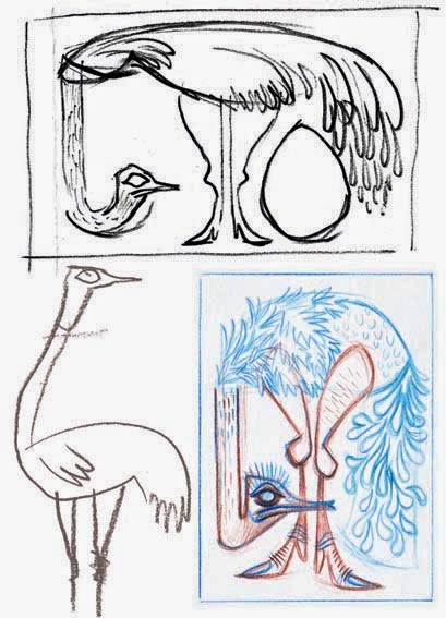
an ostrich...
Here's a sneak peek of my ostrich for this months a little bit bunny creature... as always follow the link if you are inclined to see more. I ended up revisiting a pose I'd used a while back for a flamingo illustration. I guess there are only so many ways you can arrange avian legs this long!
Saturday, 21 June 2014
don't believe those crocodile tears...
It's been far too long dear blog. Please excuse the lack of posts but I've creative projects ongoing that I couldn't post about, at least not yet. Thankfully good old a little bit bunny blog is always there, as it's supposed to do, to encourage me to blow the cobwebs off and post something. Well this months ALBB creature is the crocodile and I had great fun getting inky and tearful! Here, as always, is some of the sketch work plus a detail of the final illustration.... pop on over to a little bit bunny blog if you'd like to see all of the emotional croc.
Okey dokey, I've a book cover to design, but first I have to read the book... TTFN
Sunday, 13 April 2014
murmuration screen print designs...
A few weeks back now I was fortunate enough to witness the amazing spectacle that is a murmuration of starlings, all swooping and pulsing in a flock before they roosted for the night. It really is a jaw dropping sight to see... and hear. It sounds just like the sea breaking on shore and, when two masses of birds conjoin it actually moves like waves crashing and flowing together.
I really wanted to try and do justice to the scene and cook up a screen print illustration so, off an on, I've been trying to depict the flavour of the event graphically for the last fews weeks. Just like the actual murmuration itself it's such an intangible thing to capture, like bottling smoke. There are the silhouettes of the birds themselves against the sky but, more importantly, there is the motion of the flock as a whole that I'm trying to get at. The pulses, swirls and eddies of the birds all add up to a group organism that is curiously more than the sum of it's individual parts. It really is like in 1950's cartoons when the protagonist goes after the honey, gets chased by the swarm of bees, who form into a fist and bop them on the head.
It's fascinating to read up on theories about this behaviour of flocks of birds, and also bait balls of fish (something else I'd love to see), grouping in such a manner as to deter predators by, perhaps, appearing as a bigger predator... kinda like when a cat puffs up to 'look big'.... (anyone else recall that far side cartoon ? I need to reread my Far Side, it's been far too long... I digress. Here's a smattering of my exploratory sketches, photos I took of the murmuration, (some as animated gifs) and the final "Early Birds" and "Home to Roost" screen print designs. Hope you enjoy them as much as I did cooking them up!
I really wanted to try and do justice to the scene and cook up a screen print illustration so, off an on, I've been trying to depict the flavour of the event graphically for the last fews weeks. Just like the actual murmuration itself it's such an intangible thing to capture, like bottling smoke. There are the silhouettes of the birds themselves against the sky but, more importantly, there is the motion of the flock as a whole that I'm trying to get at. The pulses, swirls and eddies of the birds all add up to a group organism that is curiously more than the sum of it's individual parts. It really is like in 1950's cartoons when the protagonist goes after the honey, gets chased by the swarm of bees, who form into a fist and bop them on the head.
It's fascinating to read up on theories about this behaviour of flocks of birds, and also bait balls of fish (something else I'd love to see), grouping in such a manner as to deter predators by, perhaps, appearing as a bigger predator... kinda like when a cat puffs up to 'look big'.... (anyone else recall that far side cartoon ? I need to reread my Far Side, it's been far too long... I digress. Here's a smattering of my exploratory sketches, photos I took of the murmuration, (some as animated gifs) and the final "Early Birds" and "Home to Roost" screen print designs. Hope you enjoy them as much as I did cooking them up!
Monday, 27 January 2014
Staithes illustration greetings card...
I'm very happy to say that you can now buy greetings cards from Art Angels stockists of my Staithes fishing village (well Staithes inspired) screen print illustration (previously on Matt Dawson blog...). The production quality of the Art Angels cards are just grand with a nice heavy textured card stock with a debossd print area and a great print reproduction to boot. I'm over the moon at being listed with such printmaker luminaries also stocked by Art Angels as the superb Edward Bawden, Angie Lewin and Mark Hearld. Truly inspirational illustrators to rub shoulders with. I've already had several enquires for screen prints of the Staithes design so the sooner I can get things sorted and my house covered in acrylic and drying prints the better I shall feel!
Saturday, 21 December 2013
yule frog eats mince flies holiday pun shocker...
Nothing says festive celebration more than weak word play for comic effect ;-) Well that and poor handwriting on a card (it's been years since I wrote this much in longhand). Pull a christmas "croaker" just hopped to mind too (lucky I didn't use that then). Puns and poor penmanship aside, "Hoppy holidays to all and to all a cracking new year!" See you in 2014 folks.
Sunday, 11 August 2013
can you hear me Major Tom...?
It's like my last but one post said... anyone can do any amount of work provided it isn't the work [they are] supposed to be doing at that moment... This notion for an illustration popped into my head and pushed out the two other tasks I should have had in there today...
Tuesday, 30 July 2013
a curious concoction... the Fiji Mermaid (Feejee Mer 'made')...
This months a little bit bunny creature was already pretty mixed up to begin with. The Fiji Mermaid... also spelt in the more salty sea dog vernacular "Feejee Mermaid" was a curious concocted creature to be sure. I won't go into the whole fascinating history of the beast, save to say, as far back as the early to mid nineteenth century sailors (possibly the best makers were Japanese fishermen, recreating the Nigyo of Japanese myth... very interesting deviation from the traditional western image of the mermaid by the way...) crafted these so called mermaids from bits of monkeys and fish joined together with liberal amounts of paper mache thread, wire, wood and, seemingly, anything else that was to hand. One such example (the first to bear the name Feegee Mermaid) was exhibited to great effect by the famous US showman P.T.Barnum along with a fabricated scientific provenance. Since then no self respecting sideshow has been complete without a gen-u-ine Feegee Mur-maid!
For my humble effort I tried at first to compare the western and eastern takes on the mermaid topic or, at least, to compare the fact and fancy of the whole thing. Beauty and the beast. I think, for me however, it's the back story of the side show flim flammery that really puts the icing on the cake so I next tried to get a flavour of the whole factual tale of this creature with glue bottles, needles, thread and sideshow paraphernalia framing the subject. The DIY facts behind the myth. All that got a bit muxed ip in composition though... so, long story short (too late) I eventually decided on a kind of faux sailors scrimshaw / nineteenth century print (that will also work as a screen print) that hints a little at the historical origins of the thing while playing up the weirdness. Hope it works... especially after drawing all those decorative loops and sailors knots (not my usual style but a nice, and slightly hypnotic, visual change). I've also got sketches for a companion piece in a similar style that will show the more beautiful, seaweed haired, western 'watery bint'(as Monty Python would describe her perhaps :-)
Thursday, 27 June 2013
A Staithes like fishing village screen print... finished finally!
It's been a drawn out gestation for this screen print design (version one, version two) but at long last I've got something that captured the flavour of the fishing village that inspired me. It's been a personal project I've picked up and put down many times over the last few months but I'm glad I didn't give up on it.
The print has ended up being in three colours as I just couldn't make things work compositionally with two screens and a third mix colour. That being said, as usually happens when I play about with multiple mixed colours, I do like aspects of the design in just two of the three screens. That's the bonus I find in designing screen prints, you get two or more colour designs for the price of one.
I've worked in a different manner on this compared with other screen print designs I've done. Whereas I'd usually sketch straight into photoshop with the wacom tablet the majority of this is composed of loads and loads of scanned in, very quickly generated ink, paint and pencil elements. Actually compositing in photoshop took a great deal of time though with so many elements to assemble. I've actually surprised myself with the looseness of the final illustration and the balance of stylised and more naturalistic elements. There's so much detail and texture in there that I have my doubts on capturing everything in the screens but the looseness will, hopefully, be more forgiving of happenstance accidents in the printing process as a whole.
Now on with other less seagully things!
The print has ended up being in three colours as I just couldn't make things work compositionally with two screens and a third mix colour. That being said, as usually happens when I play about with multiple mixed colours, I do like aspects of the design in just two of the three screens. That's the bonus I find in designing screen prints, you get two or more colour designs for the price of one.
I've worked in a different manner on this compared with other screen print designs I've done. Whereas I'd usually sketch straight into photoshop with the wacom tablet the majority of this is composed of loads and loads of scanned in, very quickly generated ink, paint and pencil elements. Actually compositing in photoshop took a great deal of time though with so many elements to assemble. I've actually surprised myself with the looseness of the final illustration and the balance of stylised and more naturalistic elements. There's so much detail and texture in there that I have my doubts on capturing everything in the screens but the looseness will, hopefully, be more forgiving of happenstance accidents in the printing process as a whole.
Now on with other less seagully things!
Tuesday, 30 April 2013
an eagle looks for lunch or no stone left unturned...
It's eagle for this months creature submission on A Little Bit Bunny so here once again is a sneak peek of my efforts. I have to admit to going a smidge overboard on this one as far as planning goes. I certainly got into the eagle sketching zone by the end of things. For me that's a fringe benefit of submitting creatures to ALBB each month... I've filled the dreaded "first blank page"... and have my design thoughts on eagles underway should they be needed again. With every month of ALBB I get another creature for the sketchbook 'ark'.
Given how obsessive I got over the planning stages I decided to make a conscious effort to loosen up with the linework and colour treatment on the final piece (just a detail below) and, all things considered, I'm happy with the results... although, looking at all the sketches I'm sure I could take another crack at the tortoise, hhmmm, maybe the eagle's face too... and perhaps the tail feathers... ... enough!
I'd waffle a little more but scanning all this in took much longer than expected, I'm starving and need to go and "turn over stones" in the kitchen to find myself a meal! Pop on over to ALBB if you fancy seeing the final pic.
Given how obsessive I got over the planning stages I decided to make a conscious effort to loosen up with the linework and colour treatment on the final piece (just a detail below) and, all things considered, I'm happy with the results... although, looking at all the sketches I'm sure I could take another crack at the tortoise, hhmmm, maybe the eagle's face too... and perhaps the tail feathers... ... enough!
I'd waffle a little more but scanning all this in took much longer than expected, I'm starving and need to go and "turn over stones" in the kitchen to find myself a meal! Pop on over to ALBB if you fancy seeing the final pic.
Tuesday, 5 February 2013
fire and clouds... and back beside the seaside...
I've a big stack of low grade cardboard by my desk that just seems to love thick nib sharpie marker pen. For whatever reason my mind turned to cloud doodles today then, perhaps by way of elemental balance some flames also flared up. A quick bit of photoshop and nothing goes to waste on this blog. Next time I need to fill a sky or set something alight (in an illustration that is) I've some designs to choose from.
In fact I might well make use of my clouds sooner rather than later as I've started to tackle the seaside screen print scene I put to one side before christmas. I'm sure it was limiting myself to just a single colour print that caused me problems before. The design just wasn't feeling right. I've decided to whack a couple of colours in there, loosen up and see what happens. Here's a very rough in progress post for the present. Still planning the colour and composition. I don't know how obsessive I'm going to go with line and detail but I must admit that I'm quite liking the rough energy that this has so far. Don't over work things...!
Sunday, 3 February 2013
a tiger for self promotion...
By way of a little self promotion I illustrated this banner design recently for a UK deign company called Tigerprint. They sent out a shout for creatively minded folks to design a website banner using their company name as the initial hook... I already had a tiger design which I was sure would fit the bill... long story short, hello tiger! It was a nice opportunity to work upon the foundations I'd layed with the first screen print design, rejig some design decisions I'd made, play with appropriate hand lettering and push the character's personality that bit further (I think I just about got away with slightly unhinged expression verses lazy eyed...!? ;-).
Tuesday, 20 November 2012
Staithes seaside screen print in progress...
This links back to a post a couple of months back now about a print design I've been working on (off and on while time allows...). I've posted my research sketches and where I got up to on the design so I can move onward and upward from it. I think part of the reason I wasn't happy to date is I've forced myself to try out the screen print design as a single colour only and I've been feeling frustrated that I cannot do some of the colour mixing tricks I love screen printing for. The design acquired a sort of woodblock print feel to it that I did like, although it's a slight departure from my usual approach. Looking on stuff with fresh eyes a few weeks on really helps. I'm not sure quite how I'll proceed but I still think there is an illustration in there. If picturesque is your bag I suggest checking my previous post (link above) for a photo or google Staithes to see just how overloaded with 'picturesqueness' the place is!
Subscribe to:
Posts (Atom)