

I was lucky enough for a project to come my way recently to design a book cover (along with a poster and promo bookmark to boot). I really enjoy the challenge of doing a book cover design, translating the content of what's inside into something appropriate to both selling the book and enticing the potential reader. I won't go into specifics until it's printed but I'll admit that at first glance the brief had me really stumped.
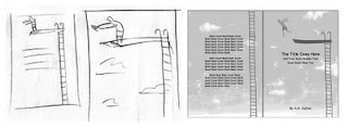
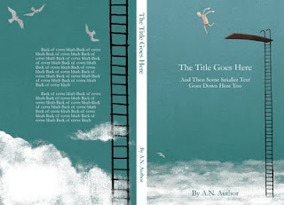
The author summed up one aspect of the book as being able to take risks, not be anxious, playfulness... so I jumped on that lifeline and along came a daredevil high diver. As is often the case, don't you find, when you just doodle (and, for me, when I should really be doing something else instead of doodling...) you get little quirky gems which you want to keep right through to the end artwork. Well the little thumbnail sketch of the hunched diver with the stringy arms had something I couldn't put my finger on but just liked so he stayed as a layer in my photoshop document right till the very end. At first the diver was in swim shorts but it just didn't have that jokey something to bring the character to life. Then, when all else failed along came speedos and a daredevil was born!
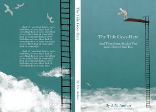
So why the two covers...? I submitted both to the client with the suggestion that the poster and bookmark could have the tentative 'pre dive' chap... a teaser for the main event of the book cover where the bold fellow shakes off the shackles of gravity and takes to the air. Luckily the client agreed, woohoo!

5 comments:
I like this so much - great concept and I really enjoy the execution.
Good one. Well done for giving them that extra little bit with the two versions, and it's really cool that they went for it.
Lovely Picture/s
Did you do it all in Pshop, or did you scan in textures etc at all? It looks very nicely un-digital.
I absolutely love this! Everything from the colour to the technique to the idea is brilliant- possibly even more (for me)the first one, due to that pent up promise of his pose.
Looks great!
I love this.
Post a Comment